Visualizing 2017 Pollution Data on a International Scale
Akshey Deokule
Motivation:
Travelling to India often, I realized how polluted it was from the poor air quality. Ever since, I have always wondered how India compared to other countries in terms of pollution if India itself was so polluted. Therefore, I used GHG (Greenhouse Gas) emission data from this kaggle dataset to pull data on emissions linked to countries in 2017.
Methods:
I was able to complete this project using Python and Visual Studio Code. To make the data presentable, I had to first clean the dataset of unnecessary data like years without emissions for example. Then, I had to use the Pycountry library to parse through the country names in the dataset and link them to their three character, alpha 3 country code. By then making the list a tuple, I was able to link this dataset with a graphical data-file which had country’s listed by their alpha 3 country code linked with a vector image of a global map. The majority of the dataset work was done using the Pandas and Geopandas libraries. To present the data visually, I used the Matplotlib library to showcase the graphical data-file with a gradient of color to represent pollution levels.
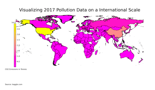
Findings:
I found out to little surprise that the USA was the major leader in pollution in 2017. However, I wish to largely expand on this project in the coming term. I want to add a slider which will present emissions data from 1990 to 2017 as you click and drag it. Additionally, I want to make the data more visibly understandable and clear by changing up the color gradient and representation values since the graph just shows the USA as a stark leader with every country at very low emissions in comparison.
Note: The one country missing in Africa is South Sudan and they don’t have nearly enough emissions surprisingly to even have a color.
Data Visualization:
Cleaned Dataset:
https://www.kaggle.com/srikantsahu/co2-and-ghg-emission-data